Intro
Here, you’ll find a collection of logos I’ve designed for a variety of clients—ranging from freelance projects to collaborations through my current role. Each logo reflects a unique story and purpose, tailored to the client’s vision and needs. While some designs showcase creative process, others were developed based on clear client direction. No matter the approach, I strive to create logos that are impactful, memorable, and aligned with the brand’s identity. Take a look!
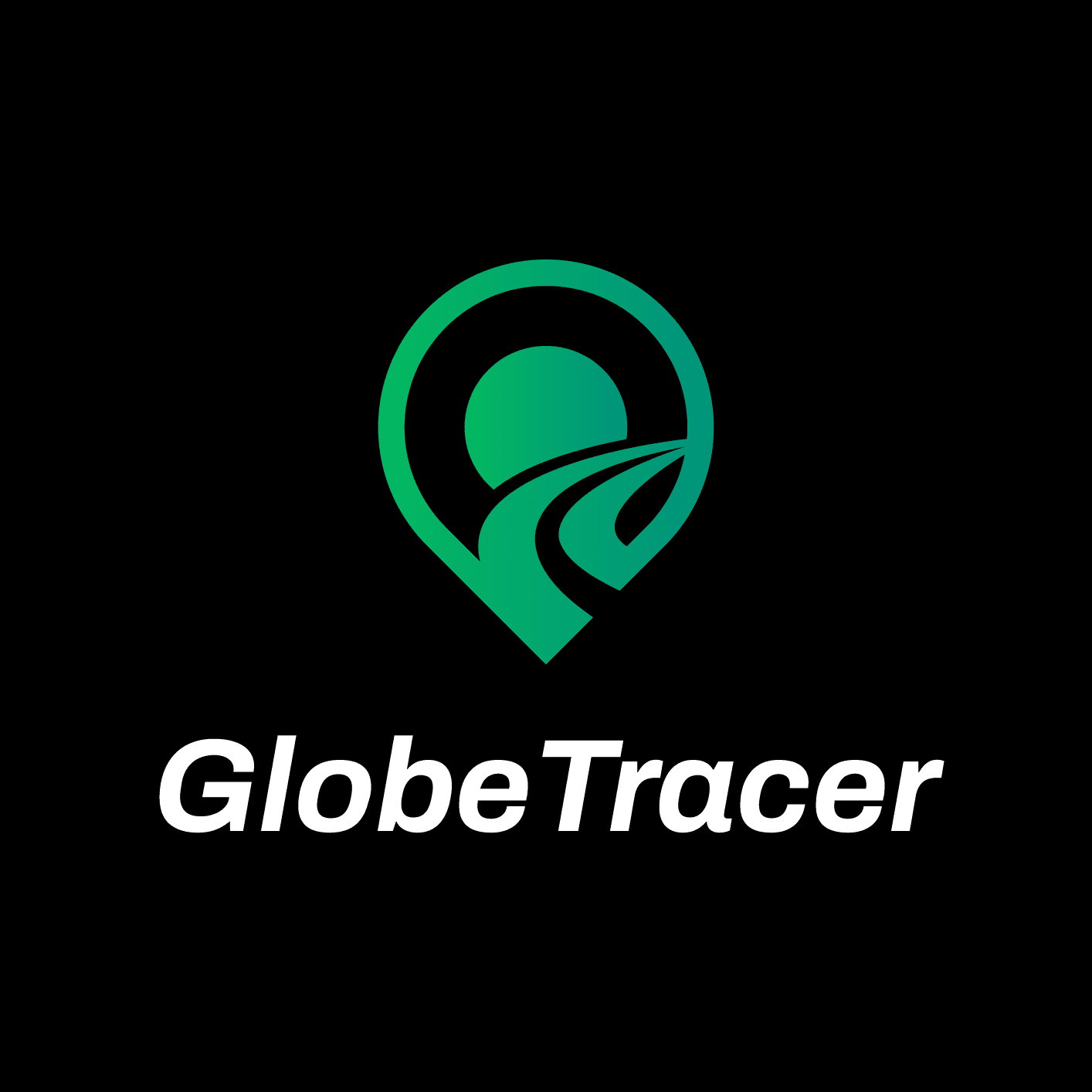
GLOBETRACER | SUBARU
BRIEF
Our team designed and developed an app prototype for Subaru that allows users to track their trips, save trip data, and share journeys with others, including geo-tagged photos showing where and when they were taken. Subaru wanted a logo that visually represents their app’s purpose—tracking trips, saving data, and sharing journeys—in a sleek, modern, and engaging way.
CONCEPTS

The logo concept features a map pin integrated with a road extending into the distance, symbolizing exploration and journey. The pin design draws inspiration from the familiar map markers used in apps, creating a modern and intuitive representation of the app’s functionality.
COLOR PALETTE
#FFFFFF
#000000
#04B960
#00927D
FINAL

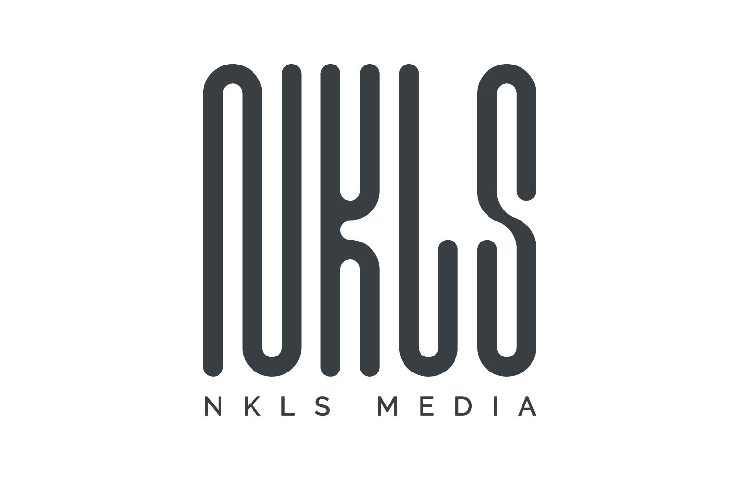
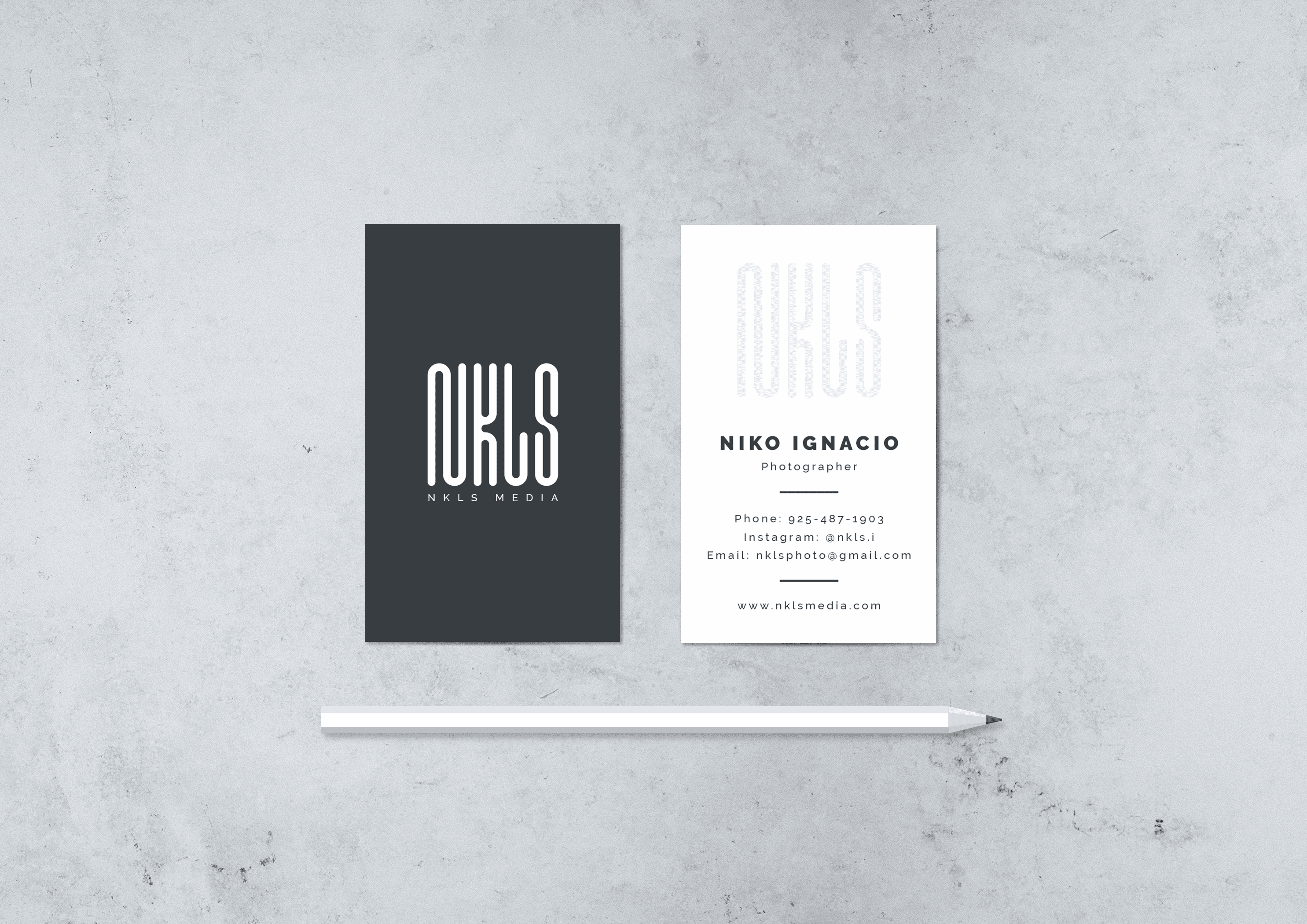
NKLS MEDIA
BRIEF
NKLS Media is a sleek and modern logo designed for a freelance photographer.
CONCEPT

Drawing inspiration from San Francisco’s iconic MUNI transit system and its modern and wavy design, the logo embodies the dynamic and vibrant energy of city life, perfectly reflecting the creative and versatile spirit of the photographer’s urban aesthetic.
COLOR PALETTE
#FFFFFF
#3A3E41
FINAL


JAPAN RISING CITY ACCELERATOR
BRIEF
The JRCA logo reflects the mission of Japan Rising City Accelerator: empowering the next generation of entrepreneurs through educational programs and initiatives for students.
CONCEPT
The logo features a modern design using negative space to depict two high-rise buildings in a third-point perspective, symbolizing growth and potential. The rounded base forms a subtle "J" for Japan, while a rocket spiraling upward conveys excitement, innovation, and the launch of young entrepreneurial talent. Together, the elements evoke upward momentum and limitless possibilities.
COLOR PALETTE
#FF7F00
#FF5137
FINAL

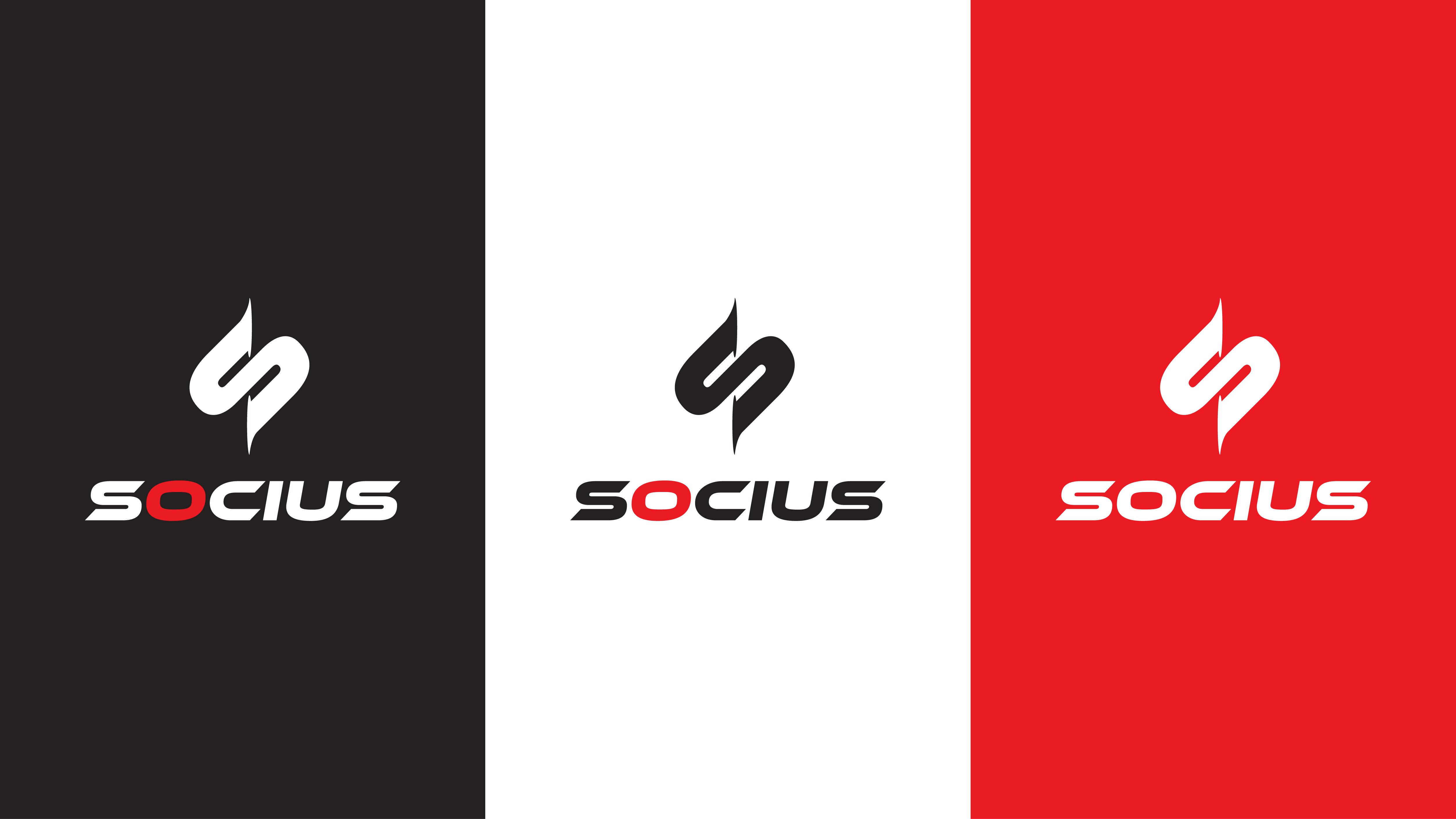
SOCIUS | YANMAR
BRIEF
I designed high-quality logos for Yanmar’s proposal to create a robot-themed anime aimed at inspiring younger generations to engage with their brand. While the project ultimately took a different direction, these logos showcased the anime’s potential and highlighted our creative expertise.
CONCEPT
The logos embodied Yanmar’s vision of innovation and youth engagement, featuring dynamic designs with futuristic, robot-inspired elements. They captured the excitement of the anime concept while reflecting Yanmar’s commitment to progress and technology.
DRAFTS

COLOR PALETTE
#FFFFFF
#252120
#EC1A23
FINAL DELIVERABLES


FIRE MEALZ
BRIEF
The logo was designed for a San Francisco-based food service specializing in BBQ and smoked meats. The goal was to capture the essence of their craft with a bold, urban aesthetic that reflects their local roots and passion for barbecue.
CONCEPT
The logo features a vintage patch design with elegant cursive typography, symbolizing sophistication and craftsmanship. Stars highlight excellence, while the layout conveys professionalism and a timeless appeal, reflecting San Francisco's eclectic style.
COLOR PALETTE
#FFFFFF
#F26623
#EE1F25
#000000
FINAL DELIVERABLES


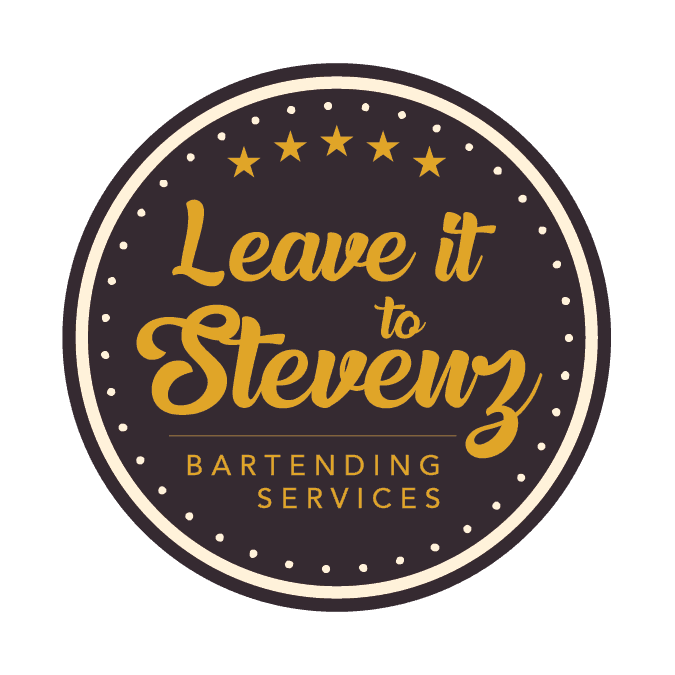
LEAVE IT TO STEVENZ
BRIEF
The logo was designed for a San Francisco-based bartending service seeking a professional yet approachable identity. The goal was to capture a classic, timeless aesthetic with elements that convey quality, trustworthiness, and authenticity.
CONCEPT
The logo features a vintage patch design with elegant cursive typography, symbolizing sophistication and craftsmanship. Stars highlight excellence, while the layout conveys professionalism and a timeless appeal, reflecting San Francisco's eclectic style.
COLOR PALETTE
#FFF3DB
#E1A528
#000000
#01475C